Icon Design
Design System Development

.png)
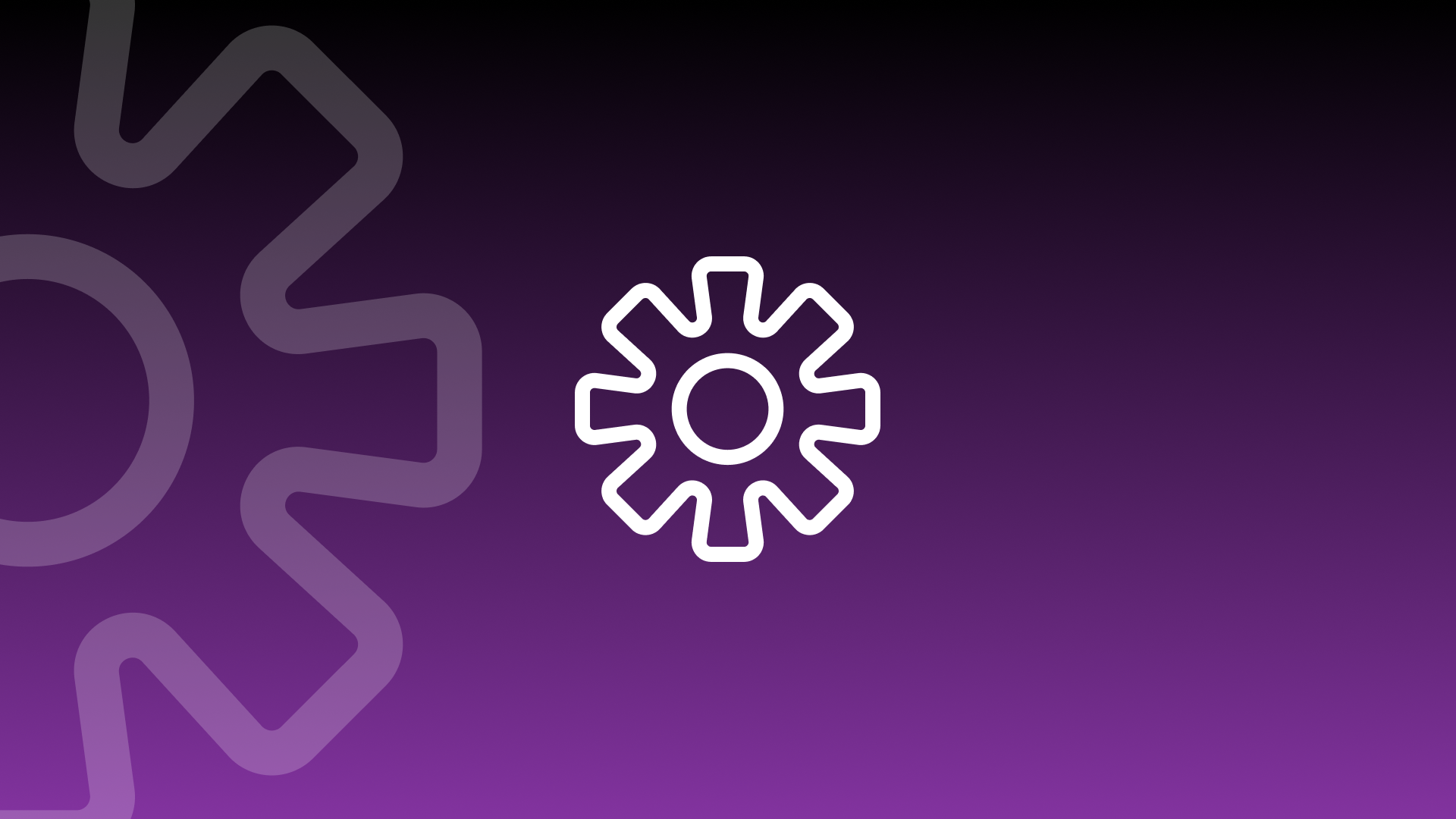
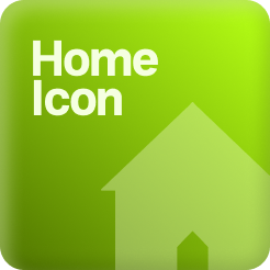
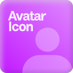
I learned icons have special jobs. Use the outline one when it’s normal. Use the filled one when it’s pressed. Super easy to see what’s happening.
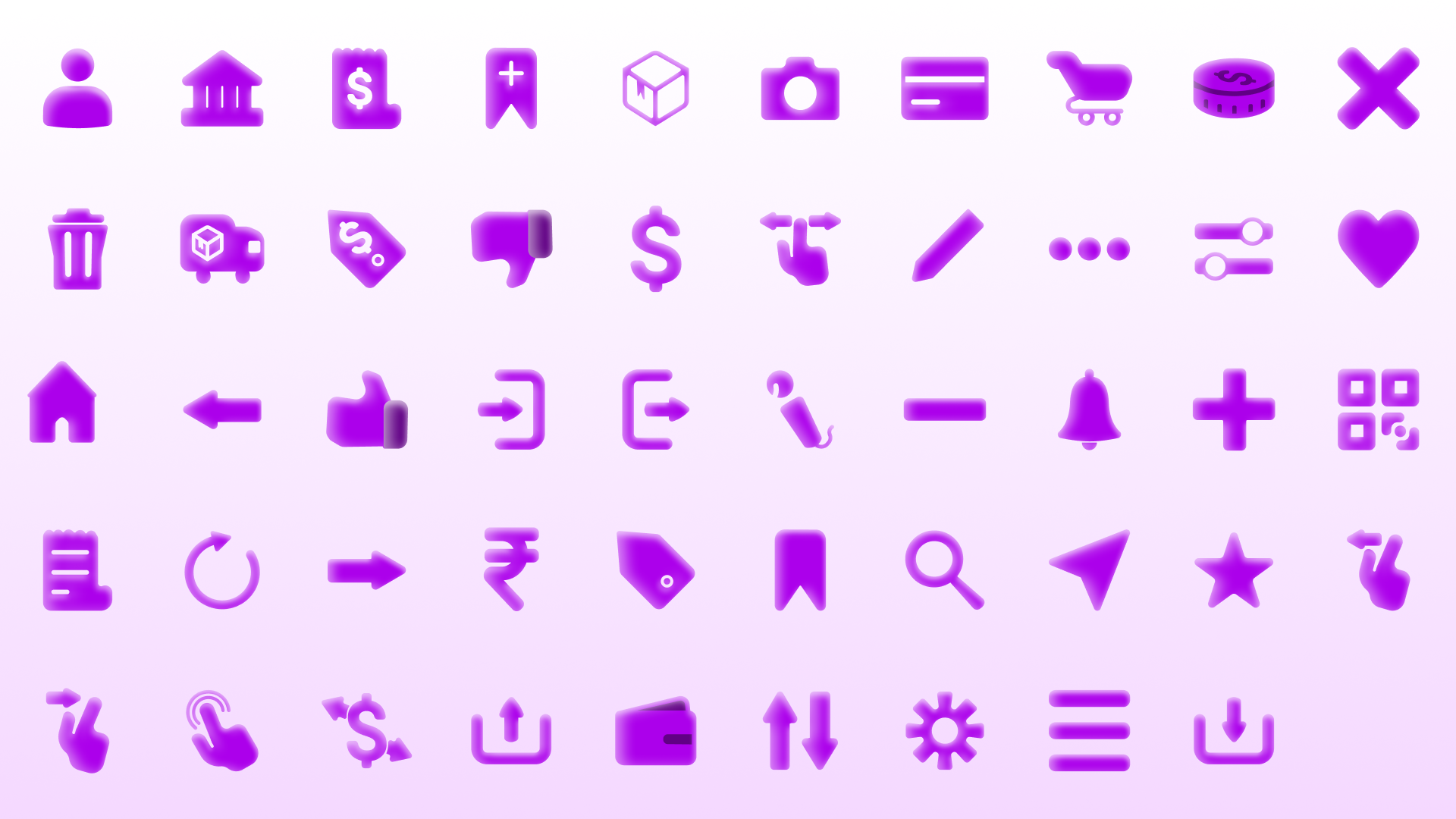
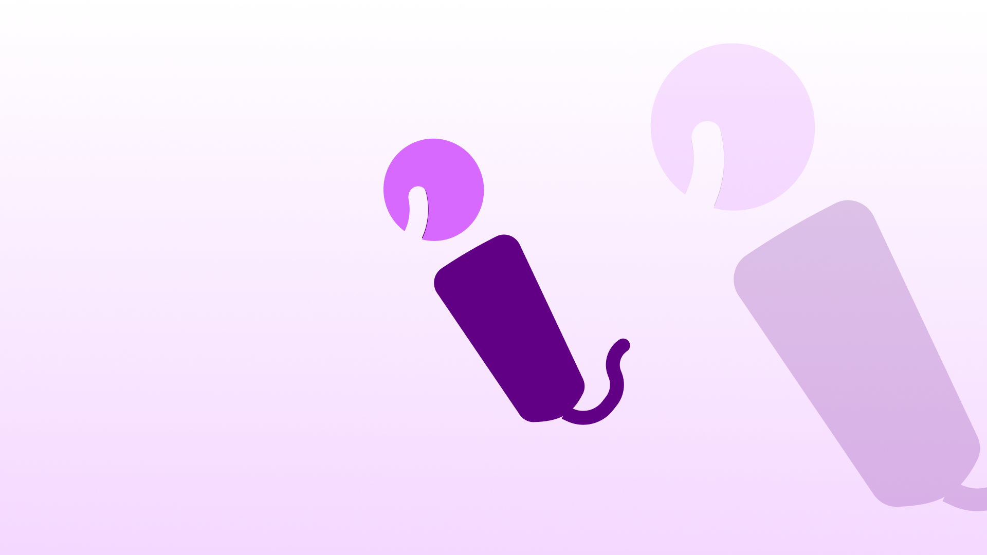
Duotone icons make the screen look nicer. They look really good with your main color and extra helper colors.
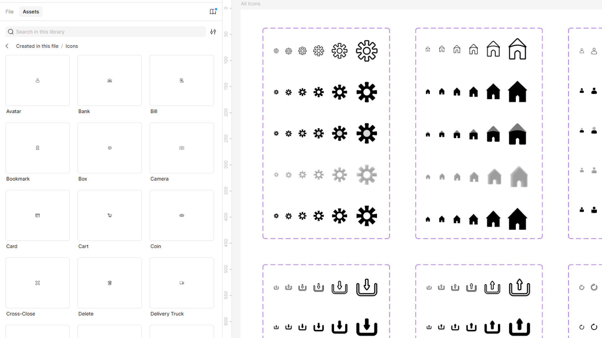
I made a easy icon system that works great even when you use lots and lots of icons. It’s ready to help your team use icons easily too